Choosing the right colour scheme when decorating any space is important but can be particularly important when creating your new office design. Colour can be a key way to inject personality into your working environment, and it can have a massive impact on how your employees feel.
The common choice for most businesses when it comes to their colour scheme, is to match it with their company branding, but this is not always the case.
Using your company branding in public and customer areas such as receptions and waiting rooms can be useful, as it provides visitors with a sense of where they are, and that they are in the correct place. However, in your working areas which are only seen by staff, you have a lot more freedom with your colour palette.
In this article, we will show you what colour psychology is and how this can impact your staff and their productivity, so you create an optimised working space and office design.
Colour psychology is the idea that certain colours can impact human behaviour. Different colours can have different meanings and connotations attached to them, and these meanings can vary across cultures. However, there are some generic connotations attached to some colours that can appropriately influence your colour scheme choices. Below, we will talk about some standard colours that you may use when envisioning your office colour scheme.
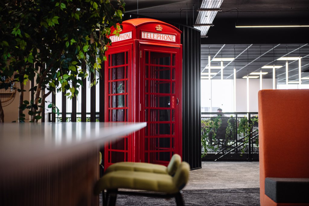
Red is an extremely bold colour and therefore attracts the most attention from onlookers. It also radiates strong emotions such as passion, love, strength, and power. Because of its boldness, it can additionally be seen as an energising and exciting colour.
Because red is such an emotive colour, it is perfect to use for your office design when you want to energise and motivate your staff, especially on those all too often dark and miserable mornings. This colour can help to give your staff confidence and motivate them to be bold in their decision-making.
Although this is a great colour, try not to use too much of it, as it can be straining on the eyes.
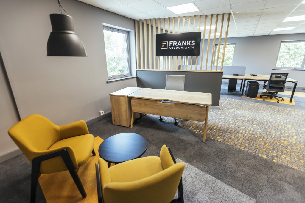
The colour best known for its fun and optimistic connotations, yellow is the colour most associated with the left side of the brain which sparks creativity. It also has many connotations associated with happiness and positivity too, making it a great choice if you want to create an upbeat and inspiring work environment.
This colour may be best implemented into offices for companies with a design background such as architecture, fashion, music or performing arts.
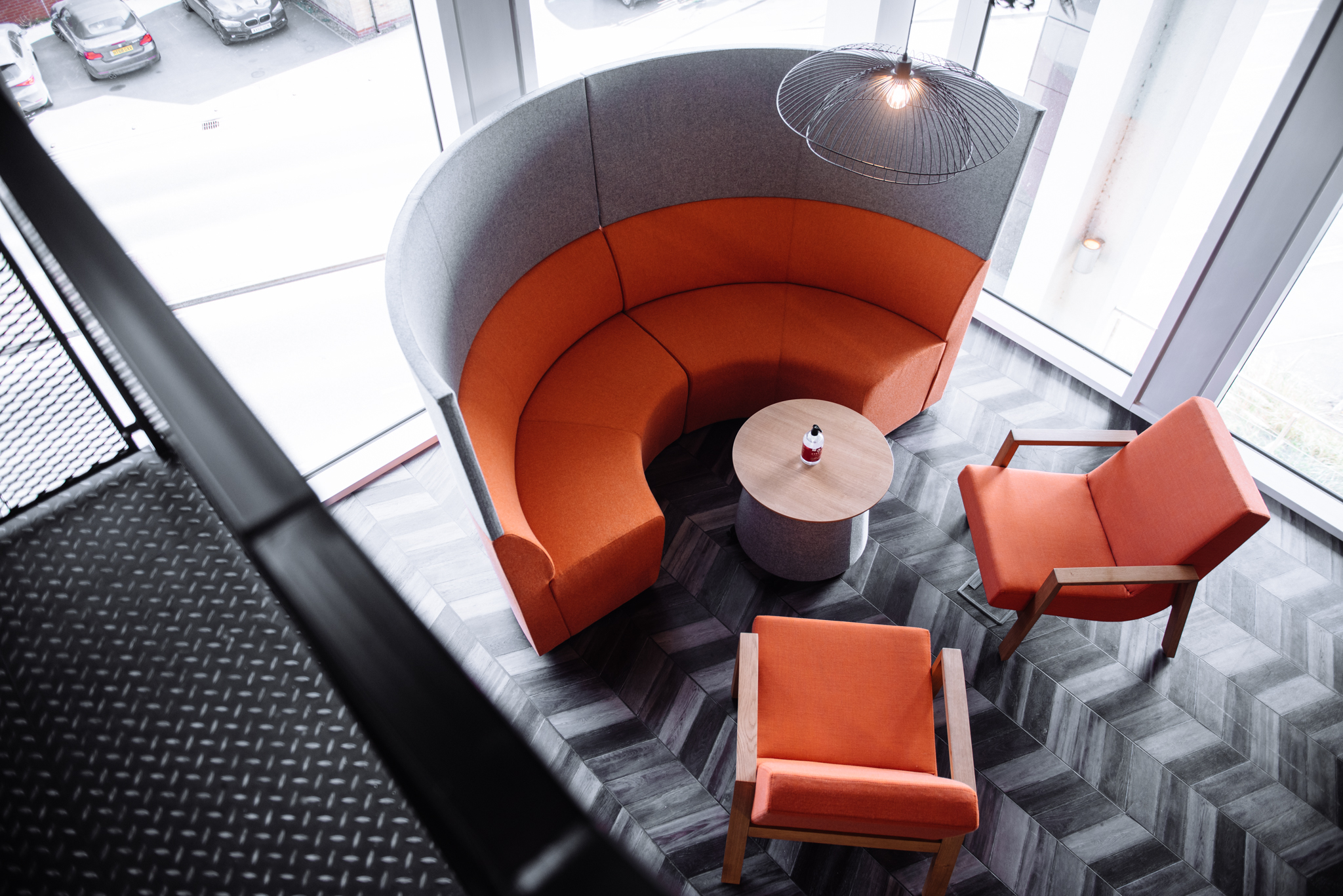
Orange is the combination of red and yellow, and consequently associates itself with qualities of both colours. More of an extroverted colour, orange exudes feelings of encouragement and self-confidence. The colour also gives off a degree of stimulating warmth and happiness, and when used in darker tones, can make people feel comfortable and calm.
Used in your office design, orange would be a great colour if you feel that your staff needs a little extra push during their working hours, and you really want to allow them to tap in to their self-belief.
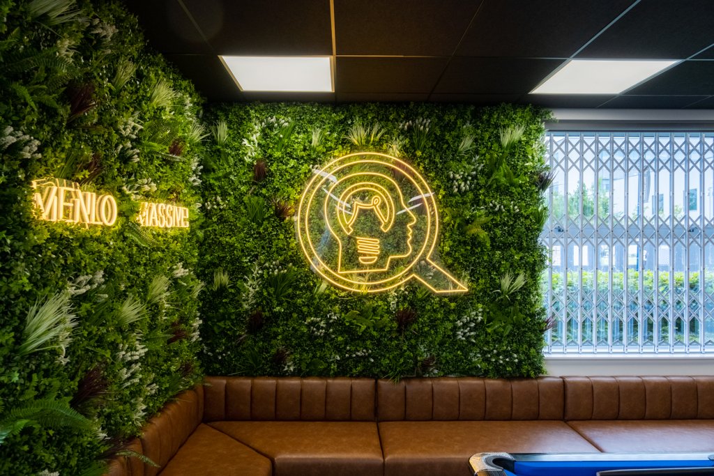
Green is a great colour to include in your office colour scheme if you want to create a tranquil working environment and promote harmony amongst your employees.
Green is a colour known for helping to reduce anxiety. Additionally, this colour is traditionally associated with renewal and life. Having this colour included in your colour scheme will hopefully allow your staff to feel refreshed and revitalised every time they enter the office each day.
Blue is a colour that can promote different emotions depending on the shade. Lighter shades of blue can provide staff with similar feelings to green, these being calmness and tranquillity. It also has an association with trust and reliability. If you want to help your staff feel secure in your office space and trusting of their peers, try and implement this colour.
Alternatively, deeper and more pronounced shades of blue help to promote organisation and proactiveness. If the nature of your company is one that is fast-paced, this colour can help to keep your staff and business on track.
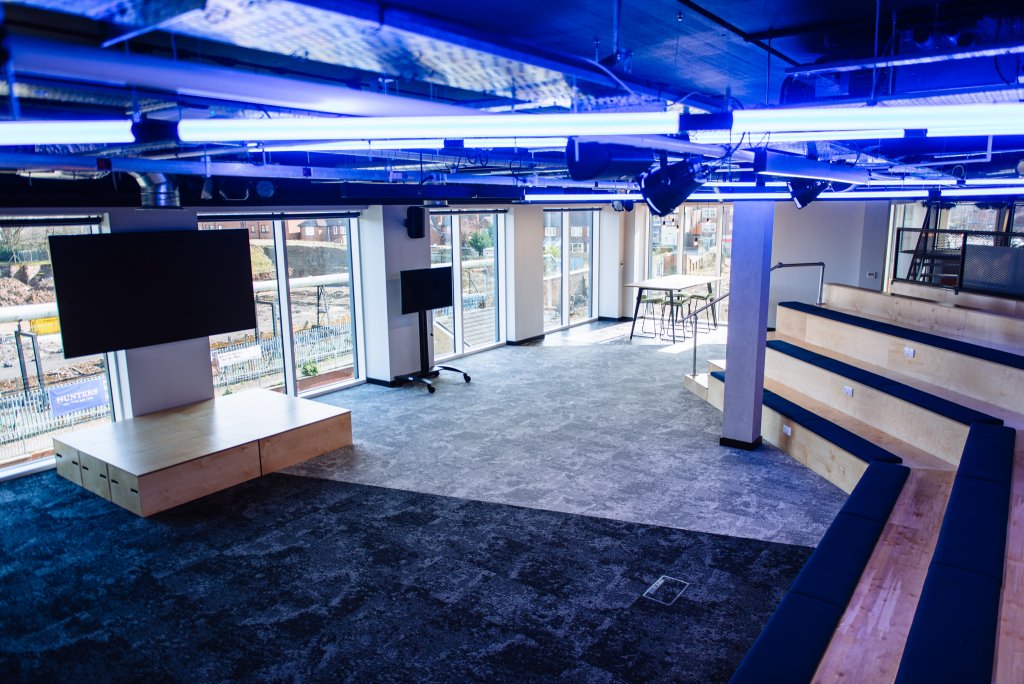
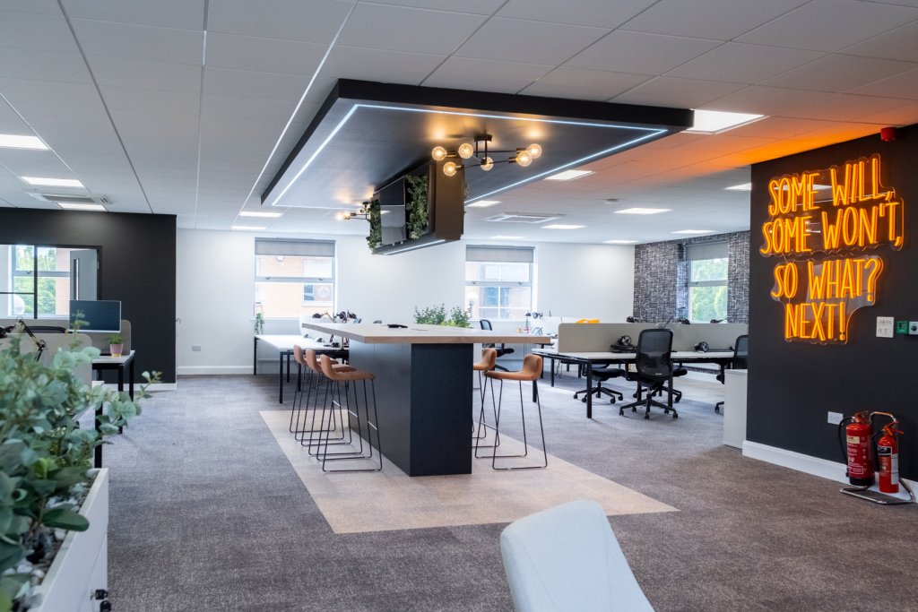
A colour which has connotations with control, seriousness and professionalism, the colour black can be a beneficial to colour to use if your business is more client-focused, or you need staff to work independently.
However, because of its lack of brightness, it can often be found to be a de-motivating colour too, so it would be best not to implement it in large portions.
You wouldn’t usually think that the colour of your wall could have a large impact on your staff and their mentality whilst at work, but in fact it does.
This can be a useful tool to help you create a standardised attitude your employees should have towards work whilst in the office, and can be the making or breaking point of your staff.
Although you now may feel inclined to cover your office walls in one distinct colour, don’t get ahead of yourself. Especially where primary colours are concerned, having one solid colour on every wall can be extremely overwhelming and after a while can get boring to look at. Instead, look at what colours compliment each other to create intricate designs that can be both stimulating for your staff and achieve the desired impact on them too.
At BI, our design and build team we will work with you to create a personalised colour scheme and design that can be the initial building blocks for the rest of your office design. We can also help you with with conceptualising your overall office design and consult you on your office space planning to further optimise your office layout.
If you’d like to speak to us about our office design and build services, contact us now!